.

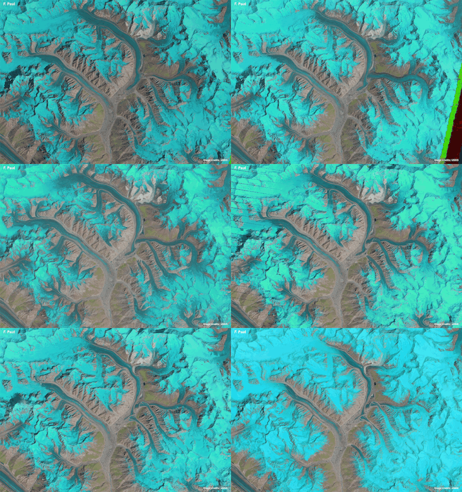
Animations that compress 25 years of satellite images into just one second reveal the complex behaviour and flow of glaciers in the Karakoram mountain range in Asia.
Frank Paul, a glaciologist at the University of Zurich in Switzerland, used images from 1990 to 2015 captured by three different Landsat satellites to create timelapse sequences of four regions in the central Karakoram: Baltoro, Panmah, Skamri–Sarpo Laggo and Shaksgam.
This mountain range is home to some of the highest peaks in the world, including the famous K2.
While timelapse films using daily photographs from cameras stationed at glacier fronts are available for some glaciers, they show only changes over a few days to a few years and only for a small part of a glacier.
Since global change is having a direct effect on the environment and society at large, it is more important than ever to understand exactly what is happening to our planet so that informed decisions can be made – as will be highlighted even more at the upcoming COP21 conference on climate change.
Satellites are the only realistic means of observing changes systematically over a long period of time, particularly in remote regions such as this mountain range.
The study was carried out through ESA’s Climate Change Initiative which treats glaciers as an ‘essential climate variable’. The initiative has assembled comprehensive datasets going back decades for scientists to understand exactly how these sensitive components of our environment are changing.

Published today in The Cryosphere journal, these new animations provide a novel look at glacier dynamics, revealing changes over a much longer time and at a much larger scale than ever before.

Baltore Glacier
Since 25 years of satellite coverage is compressed into one second, speeding up glacier movement by some 800 million times.
Dr Paul said, “The most interesting insight is to really see how the glaciers flow and how the individual parts of the glaciers such as the tributary streams interact.”
The animations show that they are not actually retreating, but are advancing or surging and flowing into each other.
“From a scientific point of view, the key motivation for this research was to understand the highly variable behaviour of the glaciers in the Karakoram.
“We have known about this for over 50 years, but still have a very limited scientific understanding of what is going on there. The animations are a very practical way to get a better overview and follow the changes through time,” added Dr Paul.
The timelapse view makes it easier for the human eye to follow glacier flow and detect changes. The Baltoro animation, for example, highlights how fast and steadily the glacier is flowing without changing the position of its front, while the Panmah image sequence shows several surging glaciers flowing into each other.
These changes would be hard to observe by other methods, such as by comparing side-by-side images of a glacier taken at different times.
“The side-by-side comparison is a very tedious thing as the brain cannot freeze-frame and virtually overlay the images,” Dr Paul explains.
As detailed in The Cryosphere, Dr Paul created the animations in simple gif format using satellite images freely available from the US Geological Survey. For each animated gif, he used 7–15 false-colour satellite images, with glaciers shown in light blue to cyan, clouds in white, water in dark blue, vegetation in green and bare terrain in pink to brown.
“I like the idea of applying an ‘old-school’ and very simple file format, along with freely available software, to do something that is difficult to achieve with other formats or commercial software.”
He believes that animated satellite images could also find use as educational tools, helping the wider public understand glacier dynamics.
“But most importantly, anybody can create these animations. Everything required to do it – both images and software – is freely available, so I recommend trying this at home.”
Quelle: ESA
4309 Views
